Emil Froby’s short-form experience on one page
Emil Froby is a professional video editor and content manager working in short-form content. His own introduction centres on using data-led insight to turn ideas into engaging stories, with experience across creators, brands and businesses. He also describes work spanning IRL, gaming, animation, drama and reaction content, alongside running original YouTube pages in several niches.
That breadth needed a confident presentation. Rather than making visitors work through a dense CV, the site begins with Emil’s role and approach, then moves into a concise personal introduction, selected areas of work and direct contact options. Prospective clients and collaborators get the essential context quickly: what Emil does, how he approaches content and where his experience sits.
Client work, faceless content and a personal page
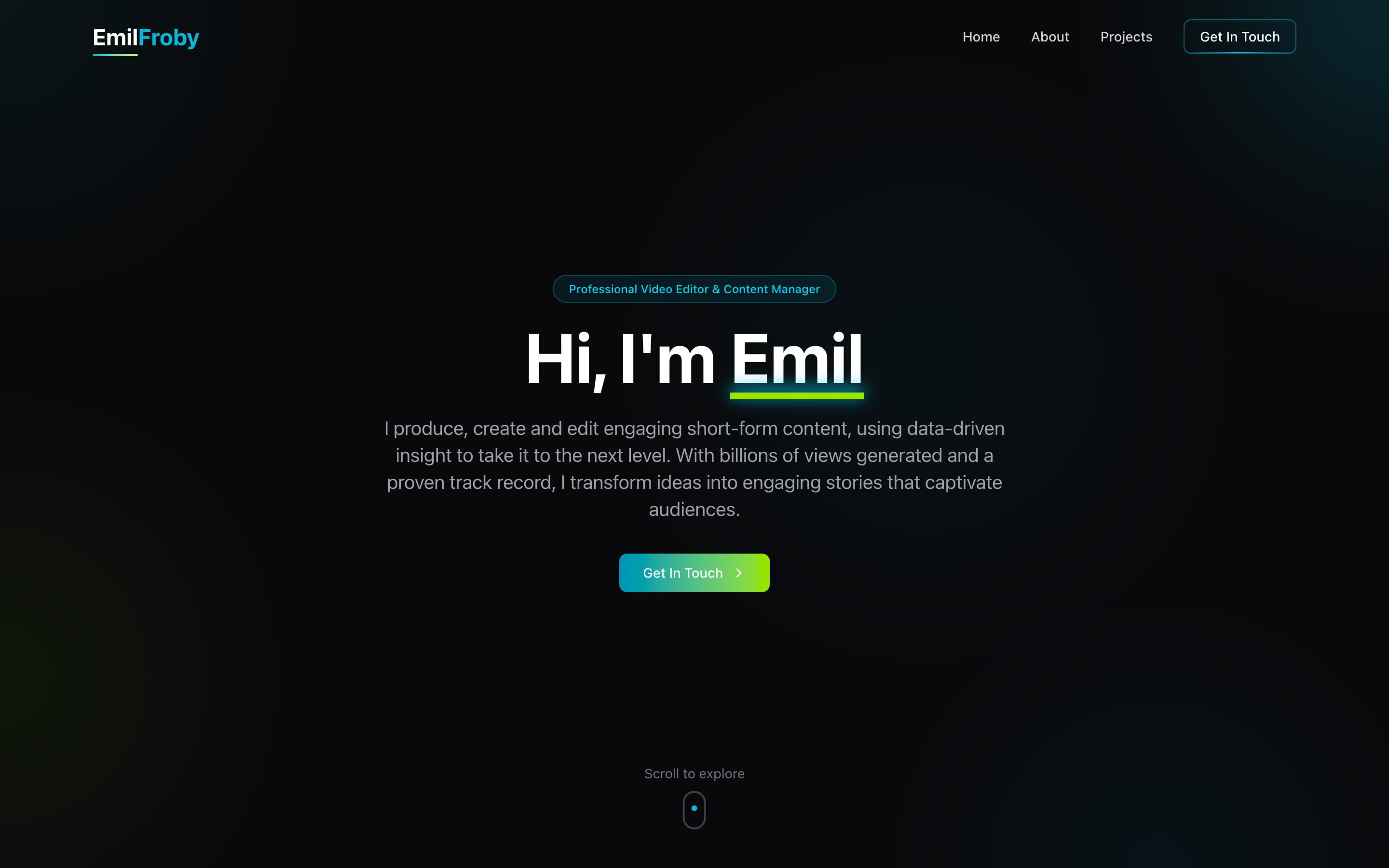
A strong editorial structure keeps attention on Emil’s experience. A large split-name masthead and the statement “Professional Video Editor & Content Manager” establish the personal brand immediately, and the navigation lets visitors jump between Home, About, Projects and contact.
The About section has room to explain Emil’s background in editing and content strategy. Projects then separates his experience into Client Work, Faceless Content and Personal Page. Each category carries a short explanation and its own metrics, rather than folding several distinct kinds of work into one general portfolio claim.
For a creator-focused portfolio, that split matters. Someone looking for editing support can pick out the relevant work quickly, while a visitor interested in channel-building or educational content can see those strands on their own.
Cyan, green and generous white space
White, near-black and soft grey form the foundation, with electric cyan and vibrant green reserved for emphasis. It feels crisp and digital without competing with the writing or the headline figures. Generous spacing, high-contrast type and restrained interface elements support fast reading across the page.
Framer Motion provides the animation layer, and motion is there to make the experience feel considered as visitors explore rather than as decoration. Lucide icons give familiar visual cues to actions such as getting in touch and downloading Emil’s resume. The contact section stays deliberately direct, listing Emil’s Twitter, Discord, email and Instagram details for different ways to start a conversation.
A home for Emil’s editing and content management
Tailwind CSS keeps the interface styling consistent, which suits a small, focused personal site that needs to stay responsive and simple to maintain.
Emil now has a dedicated home for his video editing and content-management positioning. It balances a personal story with tangible project categories, then ends with an uncomplicated way for visitors to reach out about a project or collaboration.